Showing posts with label Research. Show all posts

Sunday, 13 January 2013

3D backgrounds that animate the 2D environment (Remakes)


2D animation has been able to expand its abilities from the help of 3D techniques. Now a days there are remakes of old classic movies. They make the most of the new technology and inspiration from them. These technologies are now available which was not available from the past, like ‘Fantasia 2000’ and the remake of ‘Lion King’ and ‘The Beauty and the Beast’ the magic of technology has been recognised by the animation technology. The new techniques and the unending progression of high end softwares can now improve old classical movies.

The majority of a lot of remakes of the currently produced animation, 3D was not only used for certain characters or vehicles and objects, but this has been used increasingly for environment and backgrounds, this makes it look real and appealing but at the same time keeping still appear 2D. This also makes up a spectacular segment of an animated feature film. Filmmakers have used CGI can help to create space and depth and as well as having a realistic camera angles which shows a very different advanced dimension of shot which is impossible to be done just by using 2D packages, this still have the capability of combining into the 2D dimension structure. A virtual plane is created by 3D space; this allows you to create the depth that is needed when planning to animate a believable environment effectively. Some people criticise the development and usage of 3D on its own or with 2D animation may cause in disrespect to the art tradition. ‘Peter Pan now seems to be the front runner for the CG treatment, get ready because this is another blow to traditional animation.’ although it is very clear that the use of CG has been lending skill to produce a better and more superior, high finished 2D work than rather harming the traditional animation. In the realm of 2D, the third dimension can be utilised by pulling the 3D space. This will really help aid the animators to show perspective not possible with the traditional methods.

The technology will keep on progressing which seems very unfair to assume that it will be completely to benefit of its predecessor. Instead this seems to appear more to be lending new expertise to the previous traditional techniques, this can then be applied to support and complement each other, not ruin. ‘there will always be a place for a loving hand drawn, unique and experimental types of animated films’ so new methods and techniques can help preserve this.

The uses of 3D computer software have seen some very outstanding results for the animated environments and backdrops through the use of cameras and perspective. The animation industry has decided to embrace the advanced tools yet instead of abandoning the older artistic techniques, but instead they are much more used to help and aid each other. These only interest the audiences on producing the best atmosphere. The audience has to be noticed that animation is not only created as an art form, but it also plays a very important role in the mesh of entertainment. This is why the audience need to appreciate to be successful. ‘I remember in Annecy ’99 how the audience was merciless,’ nevertheless uncaring the audience may be. Without the interest of the viewer, all the power can be lost, although the animation itself is powerful. Backgrounds and environment are used in almost all of the aspects of animation whether internal or external.

The Making and 3D elements of Iron Giant

From the Warner Bros Animation, the Iron Giant directed by Brad Bird is an animated science fiction fantasy action film. It was created by using traditional animation and computer animation. This was based on the 1968 novel ‘The Iron Man’ by Ted Hughes. The production of movie began from Brad Hughes who was impressed by the mythology of the story of the book, and with the help of Warner Bros creative control which introduced new characters that was not even on the original book. The Idea has been pitched ‘What if a gun had a soul?’ by Dean and Kent. Brad Bird has produced the Iron Giant on a Cinema Scope widescreen format which was unusual and disagreed by the other advisors, but Bird kept on and felt appropriate to use the format because most films during the 1950s were produced in widescreen formats. Eventually Bird was allowed to continue to produce the work in wide 2.39:1 Cinema Scope aspect ratio.

During the production, the initial idea of the giant oh how it looks like were all designed and created by hand even though it is a creation of a full 3D dimensional computer generation model, even the storyboarding the presence of the giant should dismiss. It takes a lot of talent and hard work because the illustrations will become the initial blueprint reference for the 3D animation artist to with. Animators found it really hard to animate the giant, a metal solid object in a smooth fluid manner, so they have decided to use computer generated imagery. Joe Johnston who had previously worked on the initial designs for the Star Wars Trilogy was the choice for the job. Once the illustrations and design was completed, the giant is now ready to be made. The 3D software chosen for the task to model the giant was called Maya. It was used to sculpt the structure, which then could later be rendered and painted with the 2D environment. They have used the same traditional techniques inherited for the other characters. They have blended a combination of Maya and Amino software packages which has the same colour palettes that are being used on both 3D and 2D elements to produce the ‘uniform, perfectly blended feel.’

When modelling a 3D object in Maya (or any other 3D packages, such as 3D Studio Max, Softimage, Cinema 4D, Light Wave and Houdini these are the well-known main softwares) the object can be viewed as a shaded wire frame. Using wireframe on shaded or x-ray helps the 3D animators very well to gauge and measure where the object is laid out. The wire frame displays all of the lines or edges, which are used to edit and model the object. These lines are also very useful for the 2D animators. Even though the model remains in the 3D basis, this adopts the features and appearance of the 3D model, though the model is rendered as a wire frame, lines can be used as a colouring base layout for the 2D world. The template would appear the same to the other unfilled outlines when it is loaded to 2D software. This is done to make the map painting process easier and uniform. This is still very important for the model giant to launch the same form of movement as the other characters showed in the movie, and to fulfil the same sequence of motion. The same techniques and structure layout has been simulated to animated the cartoon by the technical team. Traditional 2D characters are animated by pose to pose, by creating a different new pose on every other frame rather than on each frame which doesn’t really work well on 3D animation which is unusual, this has been also been adopter and used for the giant. Sometimes when the animation process is completed, the technique will sometimes result on having to take out alternate frames out from the scene, this process is very time consuming but it is so much fast and easier than hand drawing all the lines and angles of the complexly designed giant. It is very crucial during the making of any movie when adjusting and sorting out the movement of the 2D and 3D elements, as this could reveal most of the techniques used. Comparing 2D and 3D, a 2D surroundings makes movement by dealing with flat areas and alternatively ‘3D systems operate by manipulating volumes through genuine three dimensional movements.’

The style and movement and techniques were used in the ‘Rugrats’ by Klasky Csupo. They have studied and applied its unique characteristics throughout the years. They have used a similar 3D model of the vehicle to the ‘Iron Giant.’ The chosen software for the job was Maya, this is used for most of the complicated parts of the movie which makes work much more easier. As for the vehicle, all the 3D were also linear render which makes look like a blank colouring in book for the 2D animator to paint on top. ‘we don’t fully render colour… we don’t set lighting or shading on the actual CGI elements.’ The 2D software package that has been used for the cartoon was made by USAnimation. It is very effective to use the program because of its power and ease and also due to the fact that it can transit to 3D quite easily. The philosophy of the ‘Rugrats’ shows importance on the aesthetic awareness of both the 2D and 3D elements.


The Making and 3D elements of Lion King


The Lion King by Disney is entirely a 2D animation feature film, it is very clear it has been animated hand drawn traditionally. Before the movie was produced, artists and animators had to travel around Africa where they found a world teeming with life sound and colour and the landscape seem immense. Africa has ‘one of kind animals to its breath taking scenery is larger than life.’ Disney animators had all Africa to inspire them, they have shown an explosion of colours and character unlike anything you have ever seen. You will have seen, feel and hear Africa in every frame and detail in the Lion King. Animators were dealing with the beautiful visual tapestry of Africa. Directors tried to achieve having a visually unique enchanting wonderful place that no one has ever been. They have constantly captured the vastness of Africa. They have added subliminal elements like sounds for instance, simply the effect of having a character standing on open grassland and having the wind blow its mane. You won’t be able to see the wind obviously, but you will feel it because of the mane reacting to the wind and you see the grasses on the savannah being blown quite gently. Natural sensations like these elements are really hard to portray, animators had worked really hard on capturing it. Andy Gasco the lead production designer has studied a lot of painting styles that lead the animators to an enhanced Naturalism. As the art style and character designs got further in production, the animators matched the artistic elements into a unified design. Africa has inspired from the colour of the sky to a galloping wildebeest. Music has also complimented the animation’s visual art and the design of the film, it can be called colourful, mystical, majestic, dramatic, ‘or just Africa’

Animator Ruben Keno made detailed key studies of the way many various animals moved. His work became the standard reference for all the animators of the movie because he has truly captured every movement and behaviours, even having tiny little details like secondary movements are captured to show appeal and realism to the audience. In the animation his study of drawings of the wildebeest has to become a heard of hundreds. Animators found it really hard to animate every movements precisely all by hand so they had help from ‘Disney’s innovative CGI computer generated imagery’ this combines hand drawn animation with computer technology. The technician Scott Johnston was put in charge of the software. At first they had an animation of a single galloping wildebeest all done by hand frame by frame, and then made a 3D digital duplicate with the same motion. You can see the sense of motion rotating in 3D dimensions by placing a camera anywhere you want. Animators needed hundreds of wildebeest because one isn’t enough to create a group of stampeding wildebeest. They have come up with an idea simulation by duplicating the beasts and controlling the behaviour and then randomising its layout. They have made is ‘sort of follow the leader’ which now a days we call it ‘parent and child’ where you control one beast and the rest follow the path it goes. To match the galloping wildebeest with the background, they have built a map grid and placed this simulation where the bugs are replaced by the full running galloping wildebeests. After all these processes have been done, animators have then cell shaded them to look like hand drawn animation. ‘This process took more than two years to create a two and a half minute of stampede sequence.’  They have used other usage of computer animation where it was done by using CAPS, which helped simulate the camera movements such as tracking shots and was employed on the colouring, lighting and particle effects. ‘The computer might be able to keep track of hundreds of stampeding animals, but only a performer with a pencil can combine movement and emotion to bring a believable character to life.’ It has been a big challenge for all the animators, artists and technicians to getting emotional, getting things across and mechanics, having all the work go together smoothly.


The consistency of style and motion is also very important which was used for Charles Grosvenor’s ‘Once Upon a Forest’ they have adopted and used it unique characteristics. ‘Once Upon a Forest movie’ has used similar 3D techniques to the machinery and tractors which were taken from the Iron Giant. They have used a really old software to help aid with the animation of complicated parts. This is the same technique was used in the ‘Lion King’ ll the 3D was created as linear renders, making it up which is similar to a blank colouring in book for the 2D animator.

The development of Animation -John Lasseter

John Lasseter is a Disney animator who came from Cal Arts, he helped animate the old classic Fox and the Hound. He found that animation at that time is lacking something, he felt Disney’s animation style is reaching a dead end especially with 101 Dalmatians, all styles, characters and moments were wonderful but they were just the same old thing and nothing was progressing in terms of technology and techniques for the animation.

During the time Lasseter was working on the Mickey’s Christmas Carol, Disney was also creating another animation called ‘Tron.’ John was deeply inspired am thrilled from watching some of the early tests, not because of the quality of work or story but the feel of the 3D dimension feel it has generated. He was so happy and filled with ideas, he found tremendous possibilities with the use of computer generated imagery which he knew it was the future. Lasseter came up with the idea of merging both 3D world and 2D characters where it can move around freely. He was the first person in the world make this happen with the help of Disney animators Glen Keane and Tom Wilhite. He created a 30 second test film called ‘Where the Wild things are’ where it was a combination of a hand drawn character and with a computer generated background. The camera moved like a steady cam shot for the first time in animation, this followed the character in and all around the objects, it clearly shows lots of possibilities with the 3D world even though the matching of colour and textures was not quite there yet, which appears very hard solid and more approaching realism. Lasseter was quite impressed by the work and willing to develop it further and can see the future of animation evolving.

The next dream was to create a feature film using the style and techniques they have developed, they wanted to utilise the techniques for the story ‘Brave Little Toaster’ by Thomas Disch. John Lasseter had contacted other well-known and experienced animators and technicians from the Computer Graphics Industry, others worked from Lucas Films. To make John Lasseter’s dream come true, things didn’t quite go like the way he hoped it to be, things went wrong when he unknowingly has upset a few superiors in effort to stride their dream project. The Idea had been turned down when Lasseter presented his work, then in a few minutes time he got the information that he was fired from the company.

John Lasseter later then joined Lucas Film with Ed Catmul and Alvy Ray Smith and created the very first completed 3D animation short called ‘The Adventures of Andre and Wally Bee.’ This was then later followed by other shorts like ‘Luxo Junior’, ‘Red’s Dream’, ‘Tin Toy’ and ‘Knick Knack.’ After developing more of his skills, he then later moved on creating his dream of making the famous first fully animated movie ‘Toy Story.’ As we all know Pixar was then swallowed by Disney for a few years back for a whopping amount now ‘the man once who got fired from Disney decorates the role of the key decision maker.’ In my opinion, this is the best beautiful gift John can receive.

Thursday, 6 December 2012

SCULPTING and FINAL

I have attended a sculpting class for 2 days, Darren Nevin and Durran Pearse were the maker of Wolfman mask from the movie Wolfman, they have won oscars for best make up and character scuplting. I knew Darren and Durran from my Aikido club, we train together every week except when busy with work. 

I dont really know much about sculpting, but I want to create a merchandise toy for my game, kinda like the little figurines that are included in a limited edition game boxes. I am planning to model one of those to tie in my project. this shows that I have also explored other media, not just sitting down on the computer. 


I dont know much about what type of latex they are using but they are for masks. basically, it started of from making a mould of their head then a separate mould for the mask to fit in. latex liquid is then poured slowly in the mould case then pressed on with the head mould and left to dry. after dried, latex mask is ready to paint and ready to wear. the last 3 mask in these images are by darren thats why it looks so good :D


I have received alot of tips from Darren and Durran about sculpting. they gave me tips on how to do details of skin, where I need to use a cling film ontop of the clay and pick a really thin spatula and scratch lightly so no rought edges comes out. make a lot of dots for the pores to make it realistic. to add hair on the sculpt, it takes time to make, you pick a group of 4 hairs and poke it in to the pores. it is a very long process but, if i want a really outstanding work, great patience is needed. i will try apply it to a big scuplt if I got the time. it would be awesome to make a mask for my project, but I focused more on my model. I will make one when I got the time. 

I have started making my Demonio Figure, I didnt have enough super sculpey, so I have used milliput as the base on my armature to hold my character in place. this will later then be on a wooden block stand. modelling a small figure was quite a challenge and took me a while to complete but i was enjoying it. sculpting tools really helped me alot to smooth edges and go through small gaps.


SCULPTS FINAL

This is a bigger sculpt I have made first before the small figurine. I have modelled it just using my hands and a pen cover. I didnt have any sculping tools with me at first but it all worked out well. I could have used clay that hardens when left to dry, but I didnt have any, so I have used oiled based clay given to me by Darren.
I could have added textures but I didnt because, I wanted to keep it simple.


My Final Small Figurine.
the painting took a very long time to complete, I had to do 5 coatings. it was hard because, i havent painted a sculpt before, but I got used to it.


Character Animation

This is my final character animation reel.

Basically they are character animations for my game that will be later developed on a mobile game app. the idea is at these short animation clips will play once an attack is landed, basically just like the yu gi oh game. these can be used in my future game trailer to promote my game just like in my research on how they promote a toy, a little animation is layered on top and plays. 

In this reel, i have also included a live project for TL Multimedia, where I was asked to animate a short sting, and i have tied it in with this project. So i have included a minion of the water element but made it more character friendly, cute, not even considered as a demon, more like a pet. but in the future of my game, this character should be more evil looking, this shows development of my character design


Line test


1st draft in toon boom.

Game Review

RIZ AND DANNY ENJOYING MY GAME

I had my friends test out my board game and they are quite entertained by it. at first I told them the rules how to play and how to play it. I had to explain it as they go along aswell. at first, they couldnt get the controls of flicking the pen right, it goes every where, but they longer they play, the better they become. an issue about my board game is that, the pen digs in the paper and made it hard to flick. a way of solving this problem is having my board game laminated and use dry wipe pen instead, so it is easier to manuver around the board and easily rub off the marks so it can be playable again on the same board. another issue is pen mark going over other marks creating a dent which make the next shot tend to track the last shot. and using erasable pen still bleeds through the paper, ball point pen works best.


This is the result of a 2 hour gameplay with my friends :D


Here's a bit of review they gave back to me :


Riz: "'Twas a fun play! better to use felt pens on a dry wipe surface :) "


Danny: "Initially the rules complex. they were easy to grasp once you got playing. Quite entertaining. 
Lower the amount of times you have to hit each enemy."

Final Board Game & Map Design

FINAL BOARD GAME

This is my final board game. as you can see my character design and map design are all inspired from my research. In my board game, I have put all the character information needed into the same board of the game map instead of having cards to shuffle and check through the info. I have provided boxes which includes their life points so it is easy to calculate and change number in it, no need to ruin the beautiful illustrations I made, althought the gameplay itself will be messy, at least the rest looks more professional to present. I have made symbols for the weapon and health packs. they all have different purposes like some weapons damages a certain element more than the other. by default, you have the fire element which damages wind, but I dont have a wind villain, so this inflicts 10 dp to the enemy. 

I will explain the movements. you can flick as many moves as you want to travel for the main player, but the enemy just stays put. once the enemy player thinks you are in range, he must say he is going to attack and he can flick and attack your player. I you think you are also in range, you have to let the other player know that you are attacking aswell so it is a balanced match. You can also attack when you think you are in range. You can only attack the enemy's weak points, the red and orange dot. a good tip is to attack the orange dot untill you dealt 50 dp  or more, you can attack the red dot  to deal extra 10 dp to the enemy plus your weapons damage point. I have made this so it will be a challenge for the player to play the game, no point if it is too easy. If you travelling and entered the circle range of the enemy, you and the enemy can deal plus 5 damage points with your weapons dp. Try to conserve your life points, only take the health packages when necessary. There are 3 different health packages, each health packs gives you health but also gives you different perks. The main player has 3 Life points just incase the player is too reckless. I have provided  boxes underneath the characters so there is space to compute the damage dealt to the characters and player.


Map with Characters


These are other map designs I have made. some designs I am quite pleased about because it has the right contrast, proximity and alignment and repetition. I have been inspired from my map research, but mostly followed my chosen artists Foldvari and Ville, which is very simple, graphic, attract teenagers.

 I am quite happy about this design i have developed it till it became my final piece


Final Concept Art and Character designs

Concept Art

These are my final concept arts that would relate to my board game if it were to turn into a Mobile phone app. I have basically done these in Photoshop, I illustrated the characters on their respective element and making them look like they are ready for an Invasion. 

SPIT-FIRE
Fire Demon

I have decided to use dark colours and shades of red and brown for this piece to show that the colour of the demon coming out from hell is projecting light to the soil. I have coloured inside the huge crack to make it look like a scorching hell, this helps support the back light for my character which makes it pleasant to see and used darker shadows on the foreground to give off a bit of depth. this gives off the feel of evil from my character.


NICOR
Water Demon

This piece took long to make, I have kept the mark making inspired from Jim Dine's work which shows the depth of my drawing. this helped it look more like a water element which I am proud off. I have used different shades of blue to show the light side of the water which reflects the sky and darker to show the shadow and to show the evil side of my art. At first you wouldnt tell that this is a friendly demon, it looks like its about to kill you and going after you.

I have not only focused on 2D art, I have decided to model 1 of my characters in Mudbox so I have a general idea how my character would look like in 3D. This idea / design can be used for my future Mobile phone app but this would be more on the animation side of the idea. 


GOLEM
Earth Demon

FINAL CHARACTER DESIGN FOR THE BOARD GAME

This is my final character designs which are all finalised in photoshop, I have matched my style to David Foldvari's and Jeremy Ville's work I have kept it simple, pleasant to the eyes with pen and marker feel to it. In my opinion this style has made my characters look menacing because of the black colour and especially the mark making which was taken from Jim Dine, this made my characters looks some how unique in its own style.

I have also listed down their Demon stats which shows their life points, attack points and effects on the game. this will be later used in the final design... I have decided not to create a separate card for the monsters because most people will just loose them. So I have thought of an idea having all their info's in the board game itself so it is easy for the audience to look at without having to shuffle things around.


Wednesday, 5 December 2012

Character Design

Character Design Principles

a character must benefit the animator/ artist showing that it is very understandable with its form. 
Think about the scale/ height of the character you want it to be may it be a giant, dwarf, elf size, etc... 
most happy characters are usually drawn with round edges because it is relaxing and flowing to look at whereas showing a triangular shape tends to show more of a menacing evil feel to it. a good example is this image of character design from alladin. 


as an animator we have to be able to move the form of our character if it is flexible to move in different angles. Think about the mass of your character, off-coarse the bigger and fatter the character design is, it should be a slow character because the more weight it has, the slower you move, unless you are playing a game with a cheat code with god speed :D The thinner a short you are, the less mass it has and it feels like your character can be blown by the wind
[1943_McKimson_ModelSheet.jpg]

Simplicity is always the better, having a simple design character will make it easier for an animator to animate it with less detail, the more detail it has, the harder it is to control them as they turn around in space like the image below of the Beast from Beauty and the beast, the animators probably took time to draw all those lines and details. I'm not saying detail is not good, I myself love a little bit of detail to make my work stand out a bit more, its just the idea of simplicity is best especially when animating


Aesthetics, a pleasing balance of shapes.  some artists have a really good eye for design, Gene Hazelton designed the baby image below  and composed its features in a pleasing way because of his good eye of balance. he drew  the details with beautiful combination lines of curves and corners.


Chuck Jones Also has a Natural eye for design of pleasing shapes and forms. He understands the construction of his character using strong  contrast of forms, proportion and shapes so it is very easy to animate. A good example is this image below from Road Runner, it has a very is distinct and balanced designed characters.


The graphic and simple the character is, generally is considered more as a symbol than a character. In my opinion graphic designy characters are more suitable in advert/ commercials and short cartoons.

Personality is one of the most important principle of character design, when creating a character, you need to know what role is your character going to be like, is he a funny quirky looking guy, you will definitely draw him with a huge funny looking smile on his face which is more of an oval shaped  head to body. angry but cartoony looking kind of guy would have some triangular shaped facial features on a time glass figure just like Jafar from Alladin. the personality can be contributed from the voice actor.

MOOD BOARD


I have made myself a moodboard to help me design my character. At this poit, I still dont know what theme my game is going to be so I have pick some useful references from movies, tv series etc...
I have looked at characters that are menacing, cute depending on what personality/ voice I wanna show.


CHARACTER DESIGN AND DEVELOPMENT

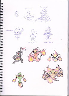
Here are all my character design and development I have designed on my sketchbook. I have decided to focus on designing elemental monsters for my game, I have even experimented on using different medias like painting and colour pencils. These designs are all inspired from my mood board, most of them look like pokemon characters and some Sonic the Hedgehog villains.