
Final Improved Version
This is my final Improved Version. I have completely changed the colour scheme, I took off the the green colours because it is a very striking colour that kills off all the other colours and makes it look more unpleasant. I have highlighted the background with more pinks blues and whites. this gives more of a romantic feel to the audience. I have taken off the unnessessary fallen leaves, ugly loooking tree and out of place fence with gates. I have dont this because it doesnt look very romantic to me and the audience according to the feedback I got in class. So I have completely redesigned the background and imagine a modern looking city with some unusual looking trees that are shaped as hearts if seen when sat down on the bench. This will enhance the cuteness to the story and would most likely attract more young women that are in love. In this improved version, as I was compiling the 2D flash animation to the backgrounds in After Effects, I played around with the shadows on the character layers. as I was experimenting, this made my work so much more appealing, it looked more like a paper cut out which looks like couple cut out doodles, similar to South Park art style, though mine has a drawing effect on it which makes it look like a doodle. I have kept this style because most young couples doodle when in love, so this is the effect i was trying to achieve.
Examples:

I have also changed the colour of the balloon in the beginning because most people confuse that the boy magically caught the balloon and gave it to the girl. I have matched the part where the buildings grow together with the girl.
Submitted version for the Clock Makers
This is the first version of my animation which I have submitted for the clockmakers competition. If you compare this to my new and improved version, you can notice big changes, like the background, colour and layout of the bench. I have taken off the unnecessary trees, and character tracking. I have kept it mostly fixed in the middle which is inspired from simon's cat. This is because I wanted to focus on the main character the girl "Lisa" this is also similar to stage acting where there are no cuts. But there are scenes that I had to have cuts to adjust for the background and close up scenes to show more emotion of the character. Having close up scenes minimises my work too from avoiding full body animation which makes my life so much easier. This saved me alot of time. I still kept the minimal colour and soft light washes to give the illusion of water colour effect which would appeal to the audience.
As for the music, I am so Thankful to Joelle Symons, she did a really great job for me, she timed every notes to every frames for me. it was awesome that she made the tune very catchy and goes well with the animation, we can feel every emotion the character is feeling.
For more improvements, I would love to correct and take away the scene where Lisa goes off to take a cup of coffee because it is not relevant, there is no need for her to go off screen. Though if I take if off, it might not match with the music well and it would sound off.
Here are some concept art that will help support my work, I have made one by experimenting on none digital media and changing its look completely. I have done this because I want to see this in a completely different perspective, different style if it were more aimed at a more mature mature audience.
I have also Asked a few 1st years and 2nd Years to do some work for me to see how they would look if this was their own animation, almost like a fan art
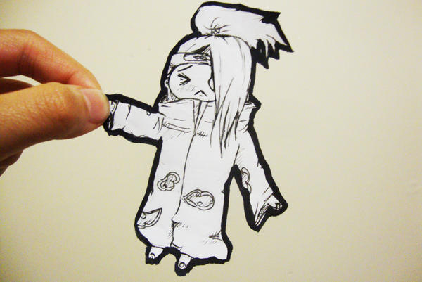
My Concept Art:
Lisa

Sofia 1st year Concept


Tamara 2nd Year Concept
