Wednesday, 5 December 2012

Character Design

Character Design Principles

a character must benefit the animator/ artist showing that it is very understandable with its form. 
Think about the scale/ height of the character you want it to be may it be a giant, dwarf, elf size, etc... 
most happy characters are usually drawn with round edges because it is relaxing and flowing to look at whereas showing a triangular shape tends to show more of a menacing evil feel to it. a good example is this image of character design from alladin. 


as an animator we have to be able to move the form of our character if it is flexible to move in different angles. Think about the mass of your character, off-coarse the bigger and fatter the character design is, it should be a slow character because the more weight it has, the slower you move, unless you are playing a game with a cheat code with god speed :D The thinner a short you are, the less mass it has and it feels like your character can be blown by the wind
[1943_McKimson_ModelSheet.jpg]

Simplicity is always the better, having a simple design character will make it easier for an animator to animate it with less detail, the more detail it has, the harder it is to control them as they turn around in space like the image below of the Beast from Beauty and the beast, the animators probably took time to draw all those lines and details. I'm not saying detail is not good, I myself love a little bit of detail to make my work stand out a bit more, its just the idea of simplicity is best especially when animating


Aesthetics, a pleasing balance of shapes.  some artists have a really good eye for design, Gene Hazelton designed the baby image below  and composed its features in a pleasing way because of his good eye of balance. he drew  the details with beautiful combination lines of curves and corners.


Chuck Jones Also has a Natural eye for design of pleasing shapes and forms. He understands the construction of his character using strong  contrast of forms, proportion and shapes so it is very easy to animate. A good example is this image below from Road Runner, it has a very is distinct and balanced designed characters.


The graphic and simple the character is, generally is considered more as a symbol than a character. In my opinion graphic designy characters are more suitable in advert/ commercials and short cartoons.

Personality is one of the most important principle of character design, when creating a character, you need to know what role is your character going to be like, is he a funny quirky looking guy, you will definitely draw him with a huge funny looking smile on his face which is more of an oval shaped  head to body. angry but cartoony looking kind of guy would have some triangular shaped facial features on a time glass figure just like Jafar from Alladin. the personality can be contributed from the voice actor.

MOOD BOARD


I have made myself a moodboard to help me design my character. At this poit, I still dont know what theme my game is going to be so I have pick some useful references from movies, tv series etc...
I have looked at characters that are menacing, cute depending on what personality/ voice I wanna show.


CHARACTER DESIGN AND DEVELOPMENT

Here are all my character design and development I have designed on my sketchbook. I have decided to focus on designing elemental monsters for my game, I have even experimented on using different medias like painting and colour pencils. These designs are all inspired from my mood board, most of them look like pokemon characters and some Sonic the Hedgehog villains.




Sunday, 14 October 2012

Research and inspiration

MAP DESIGN

I have looked into map design so I can base it to my board game. there are many ways to design a map which depends on the Contrast, Repetition, Alignment, Proximity.

Contrast- the aim is not to have a similar design and colour so it wont confuse other people about the layout. Contrast can be used to draw the attention of the person's eyes to a certain area of the map by having different depth of colours. So each design needs to be distinctive; colours which includes tone and saturation, Symbols on what they represent, Lettering, the use of typeface, weight, colour and style.

Repetition- to make a map look complete and professional it is necessary repeating themes, colours, shapes, textures, lettering. This make the map whole. It also joins objects or areas of similar attributes together, also if its separated by a large map distances.

Alignment- creating a map, you have to think about alignment where the eyes can easily track and flow through the map which would be pleasing to the readers. Visual connections between map elements are reinforced by aligning edges.

Proximity- related items should be placed together to create grouped elements. this logical groupings will hell organise map objects and will also show the structure of the map.


These are some some map samples that I can use to inspire me for my design.


I like to keep my map simple with less detail as possible or it will distract players to play the game. I have to keep in mind to use minimal colour palate or it will confuse them. I prefer the map designs which are more blocky because it is very simple. I will experiment on different styles and see which fit the best. I preferably think that top flat view map is suited for my game more than a slanted view point because it takes up most of the space of the game, unless it is used for a mobile phone app which players want a longer game play or just generally a big map.

To help myself with the layout create a map, I have looked at google maps for inspiration, I have picked this specifically because of its blocky design which suits my game map and it is easy to understand. it has a professional look to it aswell


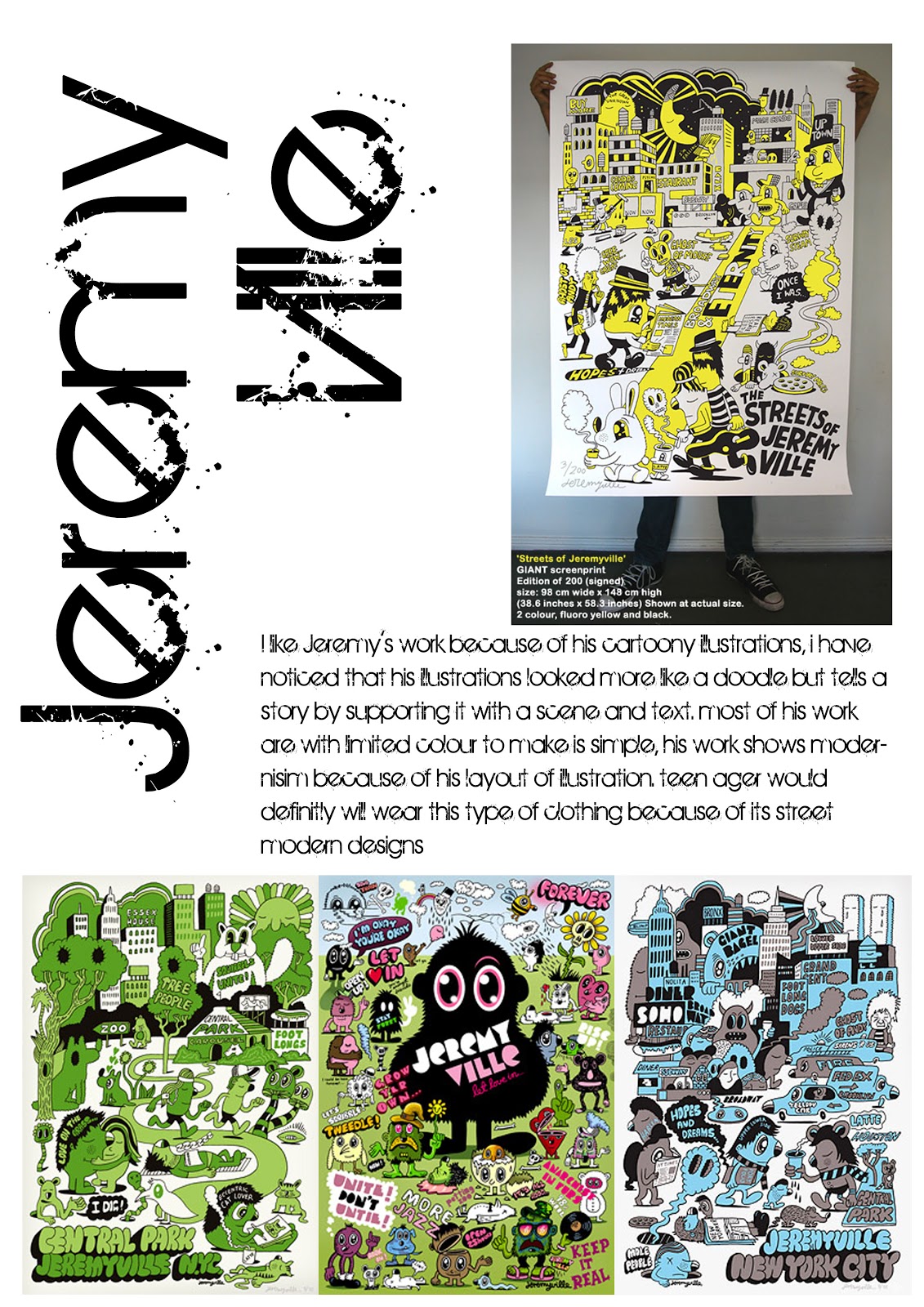
I have looked into Jeremy Vile's work because I am interested in his character design, his characters are so quirky, and fun looking, they look more like doodles which fits my game because it is based on doodles. The colours are very simple and can target ages 8 and older. Its graphic design is very good because it keeps the eye wondering. This can tie in my map design aswell because it is very clean, no unnecessary details needed. He has used minimal colours to stay with the theme especially looking at the green poster. The green is showing more of the good of the environment, showing nature, trees and animals.  

I have also looked at his Tshirt designs because, it could relate to my future work where I have to think about promoting my game by selling tshirts, posters, toys just like angry birds merchandise. My aim will be having a memorable design of my character, map and game just like the Iconic games like Mario, Sonic, Donkey Kong, Angry birds etc...
                 

This is an interesting game well known in my country called Carrom board, basically, it is played just like billiards, the aim is to hit the white piece to bounce off other colours to the pot to win, except, it is played by flicking it with your finger. This idea can be used for my board game except, I will need a room sized board to create my board game because of its quest like story, the Aim is to eliminate all the enemies to win. I will experiment on making this when I got the time especially when I am working on other live briefs. 


If we didnt have the carrom board, we usually play it on a table with coins. The aim of the game is to knock out the other persons coin off the table. It is a very fun game, I always played it when I was young, we usually call it coin game :D


This is another interesting game which was inspired from carrom. it is also a flicking game but with a foot ball twist, just like in the video, the aim is to flick your piece to the ball scoring it to the goal. I can use the idea of having the main player, flicking his piece to a main ball to attack the enemy piece.